Free Bootstrap 5 Navigation Bar Examples

What is Bootstrap ?
Bootstrap is the most popular front end web development library. Bootstrap enables web developers and organizations to build mobile-first, responsive web applications real quick. Bootstrap is an open source library for developing responsive web with HTML, CSS, and JS.
How to Download and Install Bootstrap ?
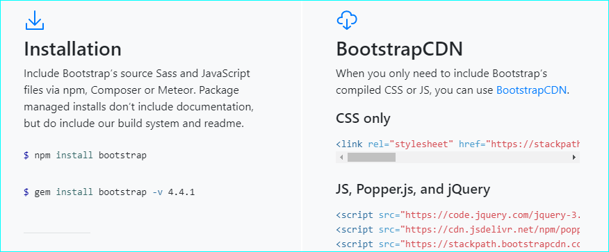
Downloading and installing Bootstrap is simple. We are not going in detail about the Bootstrap installation as there is already well written document available @ Bootstrap Official Site.
img - bootstrap courtesy.

More about Bootstrap Navbars ?
Navbars are used for navigation on websites. They contain links to different pages within the site. The most popular type of navigation bar is the hamburger menu. This allows users to quickly navigate between sections of the site without having to click through multiple menus.
Bootstrap Navbar Examples.
Navbar Example 1 - Horizontal Bootstrap Menu
Here is the Navbar Horizontal Bootstrap Menu example. Normally Navbar would be at the top of the website, unless someone choose to place it at the bottom of the website.This is great example of a free bootstrap 5 navbar. All Navbar items (menu items) are placed horizontally separated by space, and each Navbar item can have sub menu or dropdown menu to list additional sub menu items.

Navbar Example 2 - Navbar Dropdown, Horizantal Navbar
Here is the bootstrap navigation bar dropdown menu example, this Bootstrap Navbar Dropdown Horizantal menu same as previous example but only add on is each Navbar item can have sub menu or dropdown menu to list additional sub menu items. This is another great example of a free bootstrap 5 navbar.

Navbar Example 3 - Responsive Navbar, Horizantal Navbar
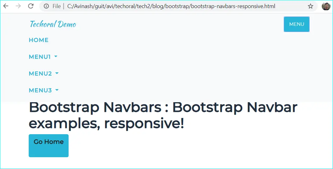
Here is the Bootstrap Navbar responsive example with dropdown. It is same as previous examples but only add on is Navbar is responsive and fit screen width of any device. This is one of my favorite free bootstrap 5 nav bars. It has a nice gradient background color and a simple menu with icons.

Navbar Example 4 - Navbar Horizantal Fixed-Top Navbar
This is another good example of a free bootstrap 5 nav bar. It is also very easy to customize. If you would like to make the bootrap navbars fixed, you might need to use fixed-top in the bootstrap navbar as show below. This fixed-top bootstrap class makes sures that the horizantal bootstrap navbar is firmly fixed at the top of the page even when you scroll down the page. Bootstrap top bar example here:
<nav class="navbar navbar-expand-lg navbar-dark fixed-top" id="techoralNav">
<div class="container">
In the below image, we see that the Techoral bootstrap horizantal navbar is at the top of the webpage, when the page is scrolled down.

Navbar Example 5 - navbar-fixed-Bottom bootrap menu example
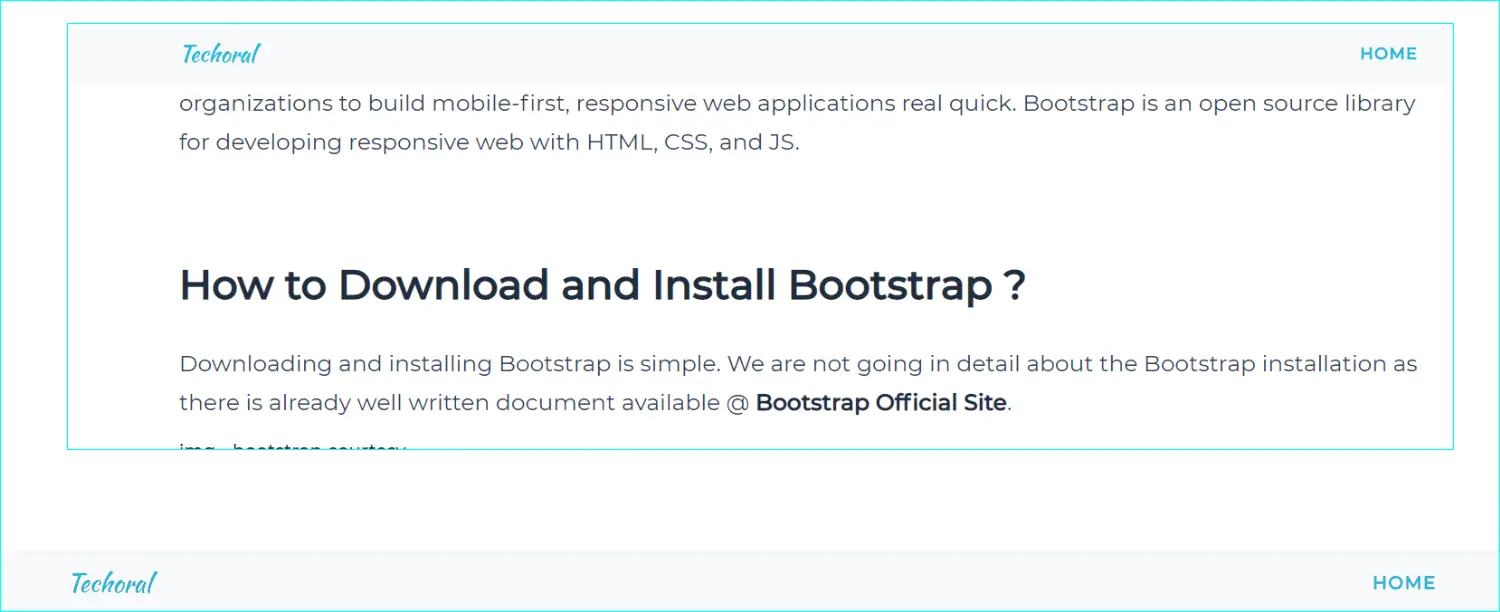
This is another great example of a free bootstrap 5 navbar. If you would like to make the bootrap navbars fixed at the bottom of the webpage, you might need to use fixed-bottom in the bootstrap nav tag as show below. This fixed-bottom bootstrap class makes sures that the horizantal bootstrap navbar if firmly fixed at the bottom of the page even when you scroll down the page.
<nav class="navbar navbar-expand-lg navbar-dark fixed-bottom" id="techoralNav">
<div class="container">
In the below image, we see that the Techoral bootstrap horizantal navbar is at the bottom, when the page is scrolled down.

Navbar Example 6 - Horizantal Sticky-Top Navbar
This is another good example of a free bootstrap 5 nav bar. It is also very easy to customize. If you would like to make the bootrap navbars Sticked, you might need to use Sticky-Top in the bootstrap navbar as show below. This Sticky-Top bootstrap class makes sures that the horizantal bootstrap navbar if sticked at the top of the page even when you scroll down the page.
<nav class="navbar navbar-expand-lg navbar-dark Sticky-Top" id="techoralNav">
<div class="container">
In the below image, we see that the Techoral bootstrap horizantal navbar is sticked at the top of the webpage, when the page is scrolled down.

Navbar Example 7 - Navbar Horizantal Static Top Navbar
Here is another example of a free bootstraps navbar. If you dont want bootrap navbars fixed or if you want static top navbar, you might need to remove the fixed-top class from nav tag. This will make the horizantal bootstrap navbar appear only at the top of the page and will not be visible when you scroll down the page.
<nav class="navbar navbar-expand-lg navbar-dark" id="techoralNav">
<div class="container">
In the below image, we see that the Techoral bootstrap horizantal navbar is not visible, when the page is scrolled down. but is visible only at the top when the webpage is loaded.

Navbar Example 8 - Navbar Vertical
This is another good example of a free bootstrap 5 nav bar. Here is the Bootstrap Navbar vertical menu. It is same as previous example but vertical. You can choose the bootstrap navbar vertical to be left aligned or right aligned.
#9 Flipkart Bootstrap Navbar Example
Here’s a simple Bootstrap flipkart look alike navbar, it is good for retail websites who would like have flipkart type navbar at the top of the webpage. This simple Flipkart Bootstrap Navbar comes with search option along with links. You can get more details about this Flipkart Bootstrap Navbar design from the below link.

Author : chawlaaditya8
#10 Bootstrap 4 Navbar with Icons
Here’s a simple Bootstrap 4 Navbar with Icons, it is good for websites who would like have navbar with icons at the top of the webpage. This simple Bootstrap 4 Navbar comes with Icons also with search option along with links. You can get more details about this Bootstrap Navbar design from the below link.

Author : tam710562
#11 Bootstrap Dual Navbar
Here’s a simple Bootstrap Dual Navbar, it is good for websites who would like have an extra horizantal navbar at the top of existing header. This simple Bootstrap dual Navbar comes with option to add more links / Icons on top existing header. You can get more details about this Bootstrap Dual Navbar design from the below link.

Author : kshiti06
#12 Bootstrap Twitch Navbar
Here’s a simple Bootstrap twitch Navbar, it is good for websites who would like have twitch like left aligned navbar. This simple Bootstrap twitch Navbar comes with option to toggle between twitch navbar with icons only / twith menu . You can get more details about this Bootstrap Twitch Navbar design from the below link.

Author : mouse0270
Read Next :
- Bootstrap Carousel Examples
- Bootstrap Thumbnail Slider
- Bootstrap Blog Carousel
- Bootstrap News Slider Carousel
- Bootstrap Thumbnail Preview Carousel
- Bootstrap Product Slider With Thumbnail Slider
- Bootstrap Carousel Vertical Slider
- Bootstrap Testimonial Slider Carousel
- Client Logo Slider Bootstrap
- Bootstrap Login Slider Carousel
- 8 Best Bootstrap Carousel Examples
- Bootstrap Carousel Multiple Items
Archives
Bootstrap
- Bootstrap Carousel Examples
- Bootstrap Thumbnail Slider
- Bootstrap Blog Carousel
- Bootstrap News Slider Carousel
- Bootstrap Thumbnail Preview Carousel
- Bootstrap Product Slider With Thumbnail Slider
- Bootstrap Carousel Vertical Slider
- Bootstrap Testimonial Slider Carousel
- Client Logo Slider Bootstrap
- Bootstrap Login Slider Carousel
- 8 Best Bootstrap Carousel Examples
- Bootstrap Carousel Multiple Items
Java
- OpenJDK Developers Guide
- Redhat OpenJDK
- AdoptOpenJDK
- OpenJDK 11 Download and Installation on Windows
- OpenJDK 8 Download and Installation on Windows
- OpenJDK 9 Download and Installation on Windows
- Uninstall Openjdk
- OpenJDK 12 Features
- OpenJDK 11 Features
- OpenJDK 10 Features
- OpenJDK 9 Features
- OpenJDK 8 Features
- OpenJDK 7 Features